Populate a PowerPoint Chart
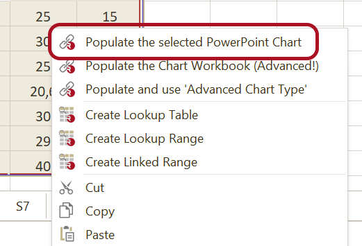
When you want to populate a PowerPoint Chart, make sure the chart is selected. In the Workbook Pane, select the data range you need in the PowerPoint Chart, right-click the mouse and choose 'Populate the selected Chart'.
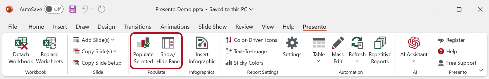
In case you need to have the workbook open in Excel, please click 'Populate Selected' in the ribbon tab in PowerPoint:
The Chart will be 'linked' to the data range, so when the data in the range changes, we can update the PowerPoint Chart (Refresh).
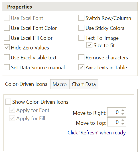
When you click a 'linked' PowerPoint Chart, the 'Populated Pane' will appear on the right side. Here you can change the following 'Populate Settings':
Conditional Formatting
In case the range in the workbook contains fill and/or font colors, e.g. from conditional formatting or from a pairwise significance comparison, these colors can be visualized using icons in PowerPoint. Read more about 'Color-Driven Icons'.
Chart settings
You can change the way the populated chart looks in the 'Populated Pane':
Most features speak for them selves and work mostly just like they work for Tables. We will say a little bit more about a few of them:
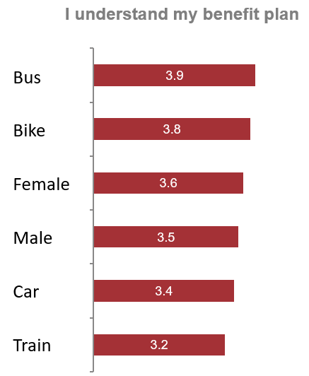
Show Texts in a Table
This feature remove the texts from the category-axis of the chart and replaces it with a PowerPoint Table, which will contain the category texts instead. The table is easier to format and edit, and makes it possible to replace texts with images.
Set Source Data Manual
In this case, the data will be added to the chart-workbook and nothing else. You have to define yourself which ranges should be used by the different chart series.
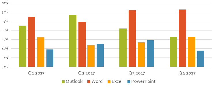
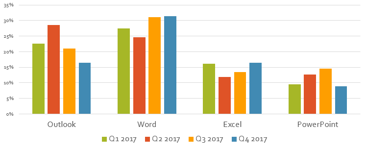
Switch Row/Column
In a number of situations, we need to switch the rows and the columns. You can do this by checking ‘Switch Row/Column’:
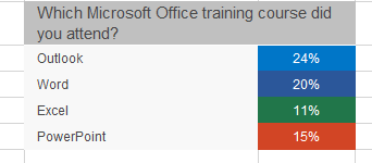
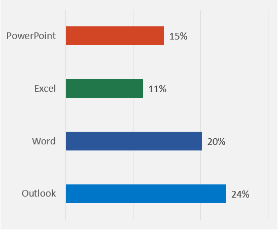
Use Sticky Colors
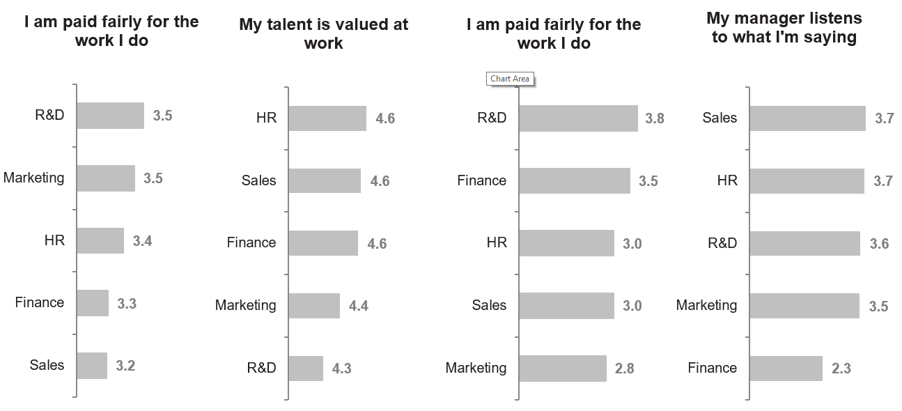
The charts above all contain the same categories and all charts are sorted descending. But it is difficult to read the charts and compare the charts. Using 'Sticky Colors' we can make the chart more readable:
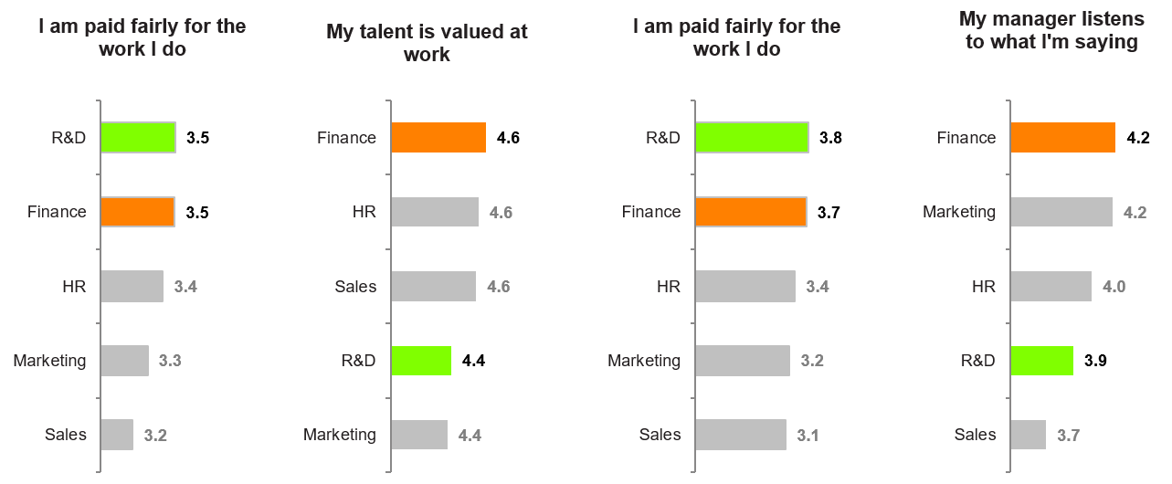
Read more about 'Defining Sticky Colors'.
Use Excel Fill Color
You can overrule the default PowerPoint chart color settings, based on the linked data from Excel. E.g. the colors of bars/columns/lines can be defined based on Excel cell fill colors:
The Excel colors above control the colors of the bars in PowerPoint below.
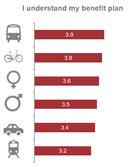
Text-To-Image
Note: Note: This only works if you have selected "Show Texts in a Table" when linking the Excel range to the chart.
When checking 'Text-To-Image', the image which is defined to replace a specific text will be shown. You define which images to use for a specific text in 'Text-To-Image' in the ribbon tab.
Using 'Text-To-Image' this chart looks like this:
Show Color-Driven Icons
This works exactly as described for tables. Click here.
VBA Macro
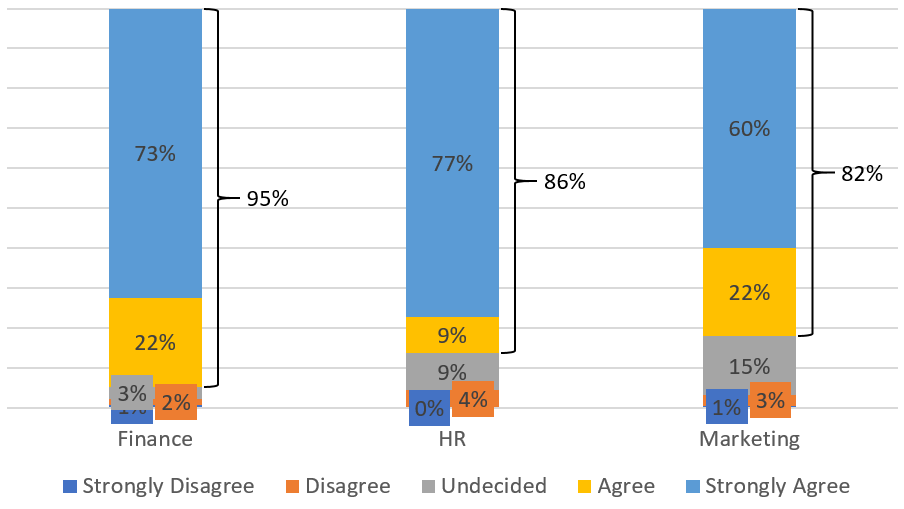
In case we do not have the functionality you need, you can add it yourself by writing a macro. Running macro 'ORTop2Bracket' adds brackets to the chart:
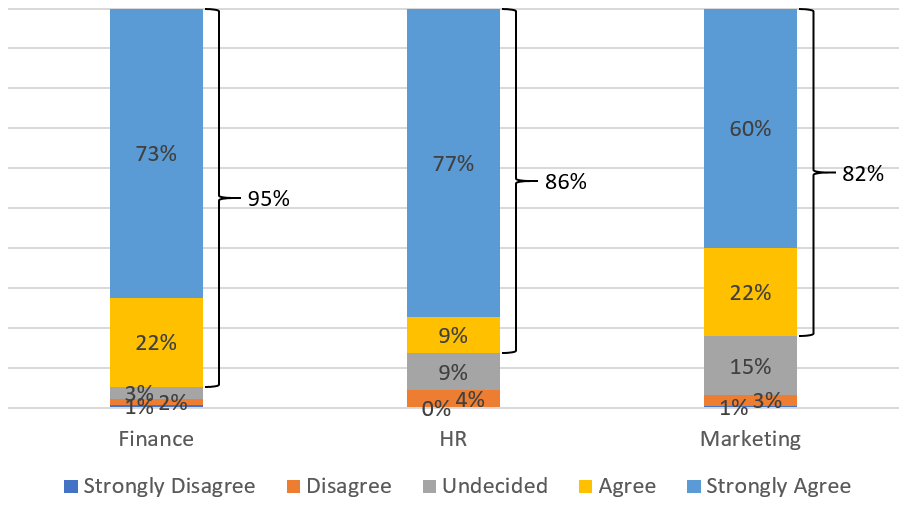
Read more about VBA Macros.
Handle overlapping data labels
Depending on the chart type selected, there is a menu tab ‘Chart Labels’ in the Populated Pane. E.g. when editing a Stacked Column chart the ‘Chart Labels’ tab will be visible.
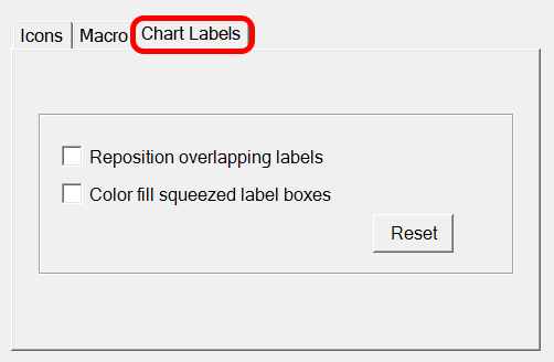
Checking 'Repositions overlapping labels results in:
When also checking 'Color fill sqeeuzed label boxes', we get the following result: