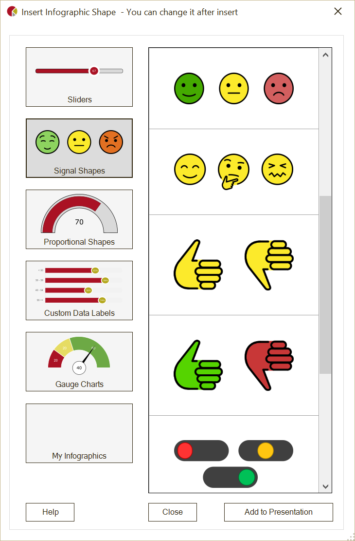
Infographics in PowerPoint
Infographics are a dynamic way to transform your data into visually engaging presentations. With Presento, creating stunning infographics in PowerPoint has never been easier. Whether you're a data-driven professional or a casual presenter, you can add these impactful visuals to enhance your storytelling. In this article, we'll explore the five types of infographics offered by Presento and when to use them. All of these infographics are available in the FREE edition of Presento!
1. Sliders
Sliders in Presento allow you to display a specific value either horizontally or vertically in relation to a bar, making it ideal for visualizing comparisons.
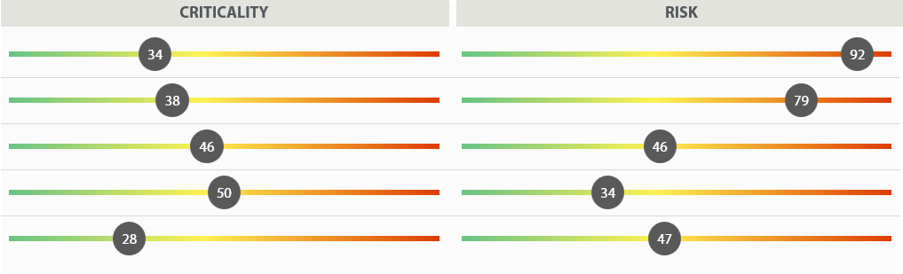
When to Use:
• Use sliders to show relative values or progress.
• Ideal for illustrating data ranges, comparisons, or performance indicators.
• Great for displaying growth trends, survey results, or percentages.
2. Signal Shapes
Signal Shapes adapt based on specific values, enabling you to show different shapes, like sad or happy faces, traffic lights, or custom icons, depending on your data.

When to Use:
• Signal shapes are perfect for conveying emotions or statuses.
• Use them to indicate satisfaction levels, approval ratings, or traffic signals.
• Engage your audience with expressive icons like smiley faces or traffic lights.
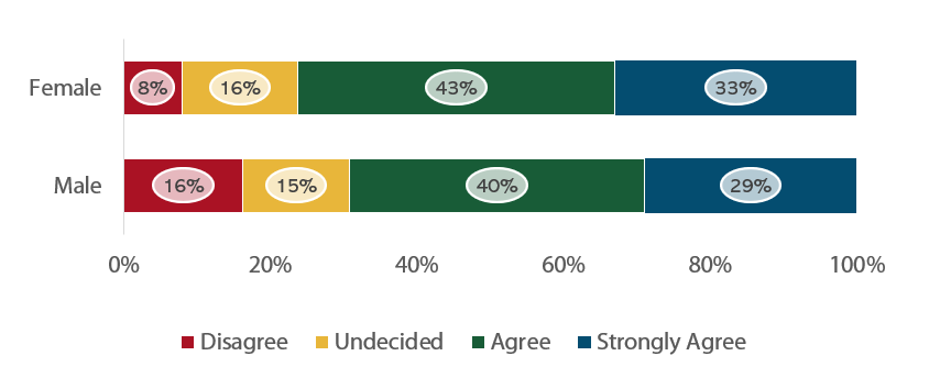
3. Proportional Shapes
Proportional Shapes fill up with color to represent values, such as a woman figure that fills to 60%.

When to Use:
• Proportional shapes are excellent for visualizing proportions or percentages.
• Showcase demographics, market share, or completion rates.
• Use them to represent data by filling shapes with colors or patterns.
4. Charts with Custom Data Labels
With Custom Data Labels, you can replace standard data labels in PowerPoint charts with any shape you prefer, adding a creative touch to your data visualizations.
When to Use:
• Opt for charts with custom data labels when you want to replace standard data labels with creative visuals.
• Ideal for storytelling and emphasizing specific data points.
• Make your data-driven presentations more engaging by customizing data labels with meaningful shapes.
5. Speedometer Charts
Also known as Gauge or Dial charts, Speedometer Charts provide a dynamic way to convey data, resembling a speedometer or gauge, making them perfect for illustrating performance metrics.You can read more about this chart type in this blog article.
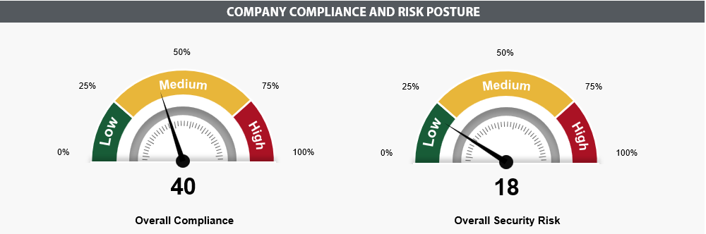
When to Use:
• Speedometer charts are perfect for indicating performance or goal achievement.
• Use them to showcase metrics like speed, progress, or achievement levels.
• Ideal for presenting KPIs, project status, or scorecards.
With Presento's easy-to-use interface, you can quickly incorporate these infographics into your PowerPoint presentations. Simply select the infographic type that suits your data and customize it to fit your narrative. These infographics not only enhance your storytelling but also make your data-driven presentations memorable.
Unlock the potential of infographics in PowerPoint today with Presento. Elevate your presentations, captivate your audience, and make a lasting impact. Get started with "powerpoint infographics" and discover the art of visual storytelling and click here to learn more about Presento.