Table Layout Settings
OfficeReports uses different layouts depending on the output you need. If you are just working in a workbook, OfficeReports by default uses a layout showing count, percentage and significance characters. This a not a layout suited for selecting a range of the table to populate a PowerPoint chart. That is why OfficeReports by default uses a more compact layout in PowerPoint, not showing count, showing significance as colors and separating totals from the categories. This layout makes it easy to populate a chart or a table in PowerPoint.
Table Layouts consist of table area and table border settings together with some default settings for the content of the tables.
Read more about the Table Border Settings.
Read more about the Table Area Settings
Read more about the Other Table Layout Properties
Default Table Layout
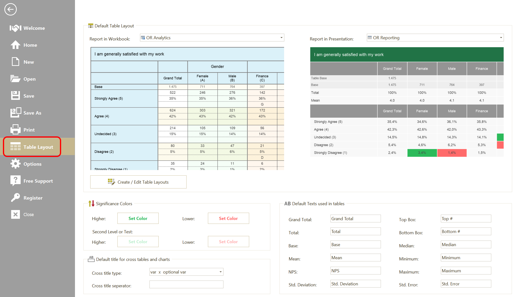
You can set the Default Layouts for working in Excel and PowerPoint here, or create new layouts or edit existing layouts by clicking 'Create/Edit Table Layouts'.
You can also change the significance colors and standard texts used in the tables.
Important: There are no other Significance settings than these settings, so changing the significance colors will effect older PowerPoint presentations and Excel workbooks when they are 'Refreshed' again.
Report Table Layout
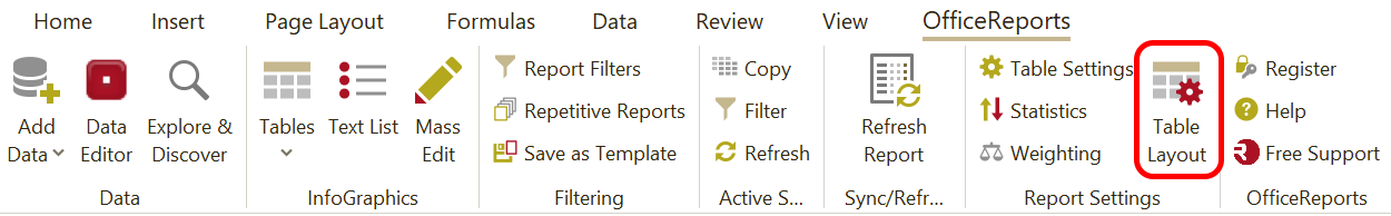
These default settings can be overruled for each workbook or presentation, except from the Significance colors. You set the Layout for a specific report by clicking 'Table Layout' in the OfficeReports ribbon: