OfficeReports Introduction
OfficeReports is software for data analysis in Excel® workbooks and data visualization in PowerPoint® presentations. OfficeReports consists of an app similar to Excel and add-ins for both PowerPoint and Excel. Here we very shortly mention the most important functionality:
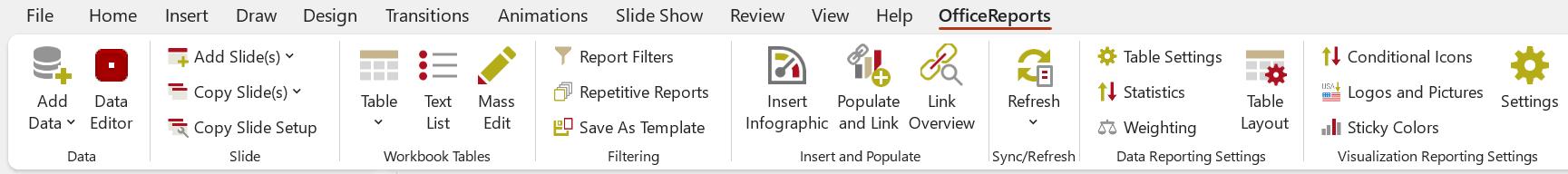
Data Visualization in PowerPoint presentations
OfficeReports links ranges from Excel workbooks to PowerPoint shapes, tables and charts and uses the content of the ranges to populate them. The font- and fill color of this content van be used to display icons in tables and charts. When the data in the ranges changes, OfficeReports can update the presentation and show the new data. The result is still a native PowerPoint presentation containing native PowerPoint shapes, tables and charts. The result can be opened and edited by everyone using PowerPoint.
OfficeReports has functionality to create ranges in a workbook containing the data and the font- and fill colors needed to get the visualization needed, depending on your starting point:
Working with already aggregated data (e.g. crosstabs)
When you are working with already aggregated data like crosstabs in a workbook, please read more about our unique methods Lookup Tables, Lookup Ranges and Linked Ranges .These concepts can create ranges from standard crosstabs create ranges so you easily can populate shapes, tables and charts in PowerPoint.
Working with raw data (e.g. SPSS datasets or Workbooks containing data records)
When you are working with raw data, you will need to import your datafile first, and then create crosstabs. To understand the files you are working with afterwards, please read Data in OfficeReports.
Special Chart Types
OfficeReports is able to create some specific chart types and info-graphics which are hard to create manually: E.g. 'Rotated Line Chart', 'Diverging Bar Chart', 'Quadrant Chart', 'XY Chart with label-table', Funnel', 'Sliders' and 'Signal Shapes'. Read more about Data Visualization and Visualization Settings.
Special Infographics
OfficeReports can visualize your data in sliders etc. Read more about Infographics
Productivity
It is a good idea to let OfficeReports organize the worksheets by attaching the worksheets to the slides. This way you can copy slides and you automatically get a copy of the attached worksheet, including the editable table definitions the worksheet might contain. This can make creating slides very fast. Read more about Productivity in PowerPoint.
Analyzing data in Excel workbooks
After importing your data file, you can create tables as shown here:
The OfficeReports App
You can both use the OfficeReports App and Excel to do your data-analysis. The app is faster than Excel and allows for table creation by dragging variables from the Data Editor and drop them on the spreadsheet. The app also shows OfficeReports functionality when right-clicking either an empty cell, a table or a worksheet tab. The OfficeReports-app reads and writes Excel workbooks and is fully compatible with Excel. The app does not support macros and does not support 'spilled array' formulas like XLOOKUP and SORT. If you need this kind of functionality, you must finally update the workbook using Excel or work in Excel all the time. The following topis are the same in both the OfficeReports App and Excel.
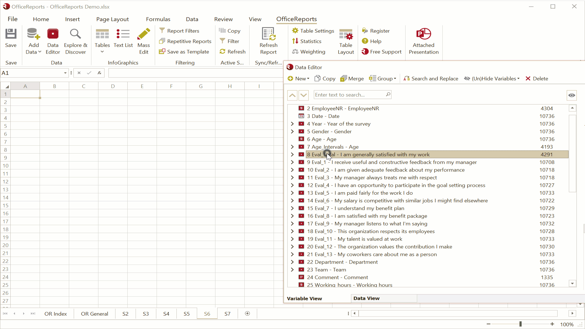
The Data Editor
In the Data Editor you get an overview of your data, in both a 'Variable View' and a 'Data View'. Here you can recode your data if necessary. Read more about the Data Editor here.
Explore & Discover
Before creating specific crosstabs, you might want to get an overview of your data using 'Explore & Discover'.
Creating tables
You can read more about creating tables here.
Create Many Tables
You can Create Many Tables in one time.
Report Automation
You can use OfficeReport both for bulk generation of reports and/or update an existing report with new data. This makes OfficeReports the perfect tool for reporting tracking surveys.