The Help Pane
Use the OfficeReports Help Pane to help you learning how to use OfficeReports. By keeping the pane visible and the 'Context Sensitive' box checked, the pane will always provide help for your current situation. Use the search box if you are looking for help on a specific topic.
Reporting Aggregated Data
This presentation is linked already to a workbook. This means you have to link ranges of data from the workbook to tables, charts and shapes on the PowerPoint slides. Have a look at the following important topics:
Preparing the data ranges
When linking data ranges to tables and charts, OfficeReports needs a single cell for each data point in the table or chart. So if your tables e.g. contain counts, percentages and significance characters for each data point in your crosstabs we will have to reorganize the table a bit. We do this by creating 'Lookup Tables'. 'Lookup Tables' contain the percentages and significance information and can be sorted both by a specific row and a specific column. Please have a look at the video below to see how the Linked table is created:
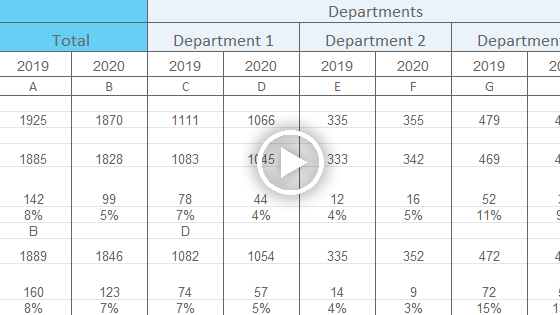
Read more about The Lookup Table
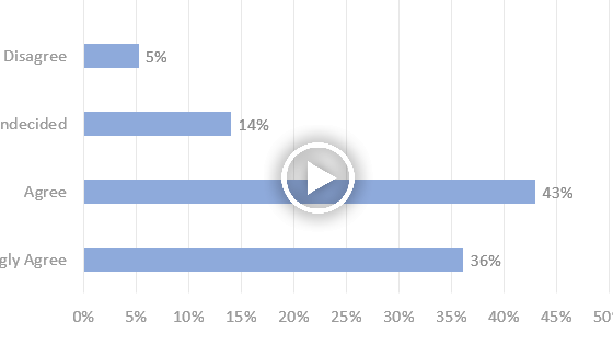
Link data ranges to Charts
Select the range you want visualized in the currently selected chart, right-click in one of the selected cells in the Workbook Pane and choose 'Link data to selected PowerPoint Chart'. Please have a look at the video below:
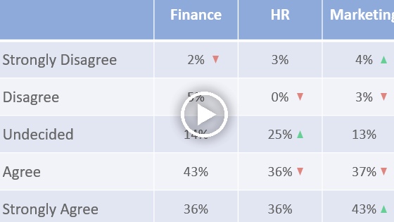
Link data ranges to Tables
Select the range you want visualized in the currently selected table, right-click in one of the selected cells in the Workbook Pane and choose 'Link data to selected PowerPoint Table'. Please have a look at the video below:
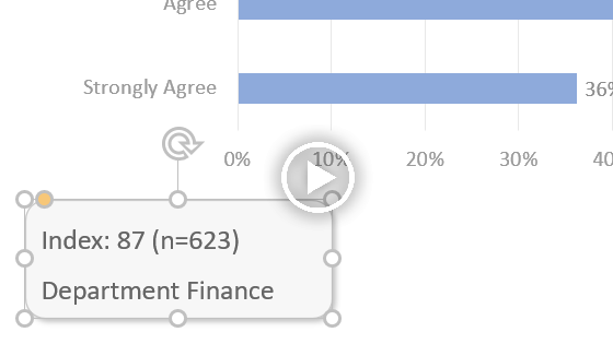
Link data ranges to Shapes
Select the range you want visualized in the currently selected shape, right-click in one of the selected cells in the Workbook Pane and choose 'Link data to selected PowerPoint Shape'. Please have a look at the video below: