Our Infographics
Insert, Edit and Populate
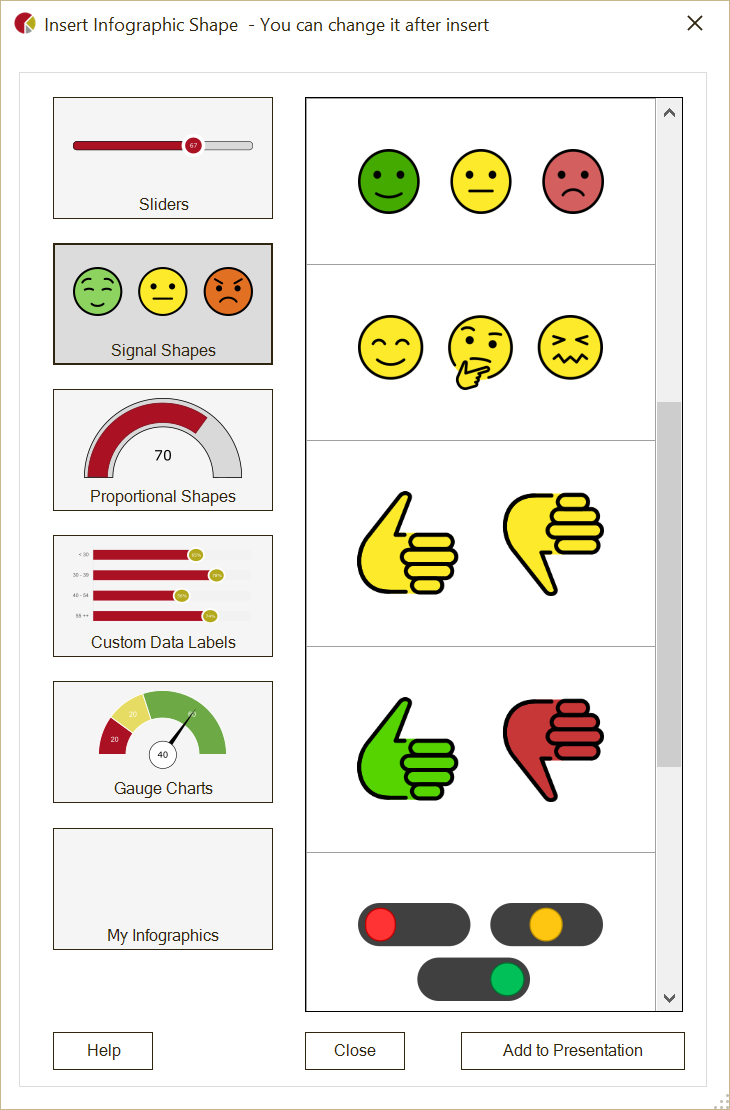
OfficeReports infographics are groups of PowerPoint shapes. In the 'Infographics' window you can choose between sliders, Signal Shapes, filled shapes, custom data labels and gauge charts and add the chosen infographic to your presentation. After adding the infographic you can use PowerPoint functionality to change the different elements of the infographic. This way you can change colors borders and resize the different elements.
Infographics are populated just like any other shape or chart. Sliders, Signal Shapes, Proportional Shapes and Gauge charts must be populated with a single value. Custom Data Labels are charts with custom data labels and are populated just like charts.
Save in 'My Infographics'
If you want to reuse the infographic, you can add it to 'My Infographics' so you do not have to make the same changes again. You do this by right-clicking the infographic and then click "OfficeReports -> Save in 'My Infographics'" in the bottom of the drop-down list.
It is also possible to add infographics to the slides in your Slide Library.
Create your own infographics
OfficeReports infographics are just groups of PowerPoint shapes and that means you can create infographics yourself. Select an infographic and open the 'Selection Pane' (Alt-F10) to see which shapes a specific infographic contains.
To make OfficeReports understand the different kind of infographics, there are a few rules for the different kind of infographics:
Sliders
Sliders must consist of shapes with the following names:
Base: After 'Base' you have to add the default minimum and maximum bounds, so the shape could be called 'Base 0 100'. These values van be changed after populating.
Point or DataPoint: This shape will be positioned relative to the base when populated. If the shape is called 'DataPoint', the value will be written inside this shape.
Bar: (optional) The bar will be resized so it is visible from the start of the Base to the (Data)Point.
You can add any other kind of shape you want to the group, e.g. a specific background. The name of the group must start with "ORSlider".
Signal Shapes
The group's name must start with "ORConditionalShape" and can contain any kind of shape. The names of the shapes inside this group must contain the minimum and maximum bounds for the specific shape. These bounds define which shape will be visible when the group is populated with a specific value. If the value is outside all the defined bounds, the group will be invisible.
Filled Shapes
Filled Shapes must consist of 2 shapes of the same type. E.g. 2 Arc shapes or 2 icons (the same icon!), which have different colors. The name must start with "ORFilledShape" and the shapes must have the following names:
Base: After 'Base' you have to add the default minimum and maximum bounds, so the shape could be called 'Base 0 100'. These values van be changed after populating.
Bottom, Left, Top or Right: The name tells OfficeReports where to start filling the shape. This shape should have to color you want for the 'fill' part.
Custom Data Labels
These groups must have a name that starts with "ORGraph" and must contain a bar or column chart called 'Chart'. The shape you want to use as Data Label has to be called 'DataPointEnd' or 'DataPointCenter', depending if you want the data label to be placed at the end or in the center. You can optional add a 'Fill' shape when using a Bar or Column chart. The 'Fill' shape will extent bars or columns to 100%.
Gauge Charts
Gauge Charts must have a name that starts with "ORGauge" and must contain shapes with the following names:
Needle: This shape will point at the populated value.
Dial or DialData: The 'Dial' can either be a Doughnut chart or an Arc shape. 'DialData' can only be used for Arc shapes and will show the populated value in the shape. After 'Dial' or 'DialData' you have to add the default rotation scale and the minimum and maximum bounds, so the Dial shape could be called 'Dial -90 90 0 100'. These values van be changed after populating.
Center or CenterData: (optional) This shape will be placed at the start point of the Needle and is used to make the needle look better. If the name is 'CenterData' the populated value will be visible in the shape.
Data: (optional). This shape will show the populated value.
You can add any other shapes you want like e.g. numbers along the Dial shape. If the Dial is a chart, you can populate the chart by selecting it within the group and populate the values you want to see in the chart.