Reporting Mode
You should use the Reporting Mode when we know what we have to report in a PowerPoint presentation, which will be you final report. In Reporting Mode, it is not possible to create summary reports and it is not possible to create charts in Excel. Even if we want to report charts in PowerPoint, we will create tables in Excel and use them to 'populate' the charts in PowerPoint.
Tables in the Reporting layout are optimized for populating tables and charts in PowerPoint. It will mostly be possible to create tables only containing the information we want to visualize in PowerPoint. Since we usually still would like to see 'base' information, the category names row is repeated so the range containing the data we want in PowerPoint is still easy to select. So easy that our 'Report Builder' can do the work for you.
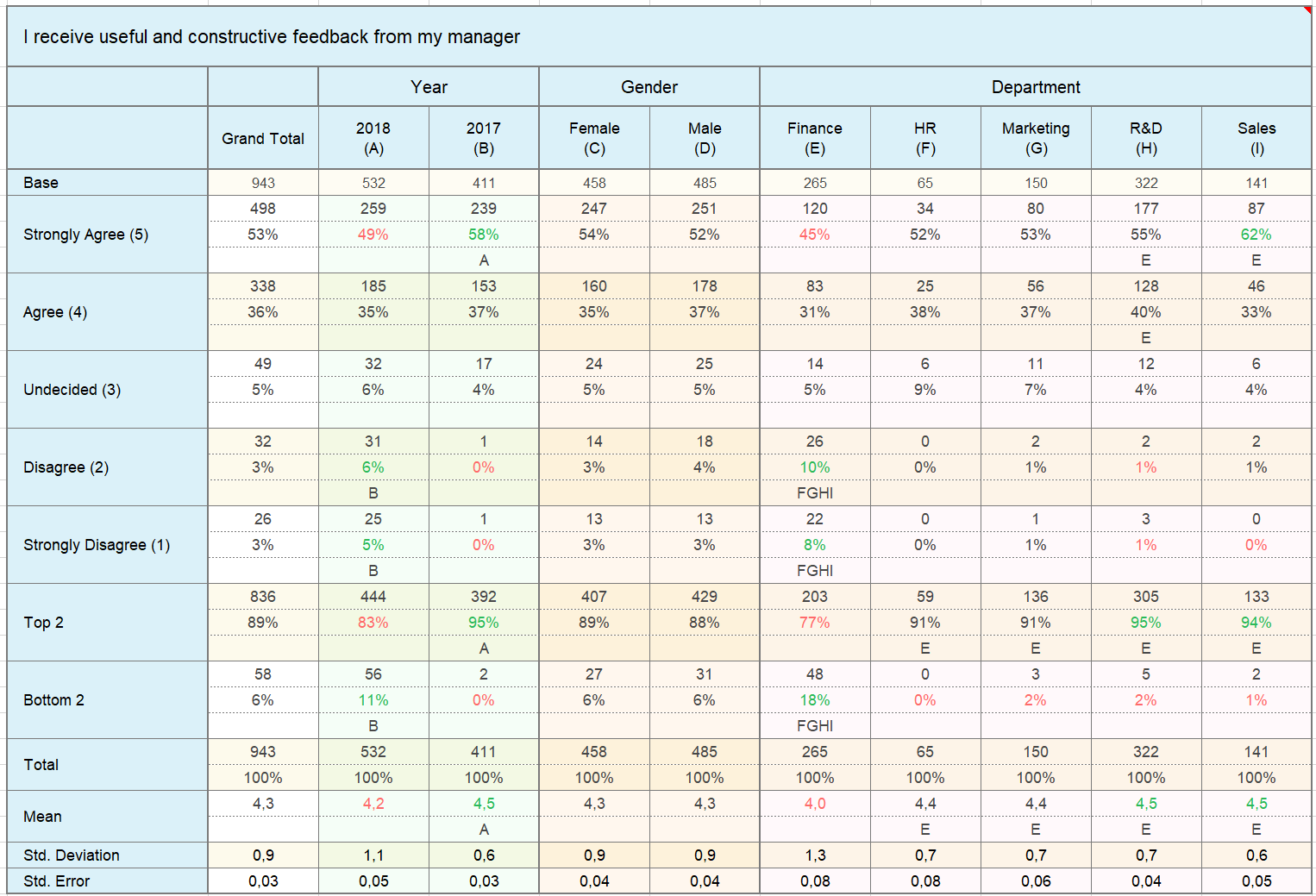
Note: Background colors in Excel can automatically be turned into significance arrows in PowerPoint.